> ## Documentation Index
> Fetch the complete documentation index at: https://docs.cloud.red/llms.txt
> Use this file to discover all available pages before exploring further.

# Form Builder

> The **Form Builder** allows administrators to create, customize, and manage dynamic forms with advanced conditional logic.

Forms can include multiple field types and support **recursive subfields**, enabling complex workflows.
Forms are attached to a script or a service and can be executed by the end user by filling up the necessary details.

## ✨ Key Features

* **Drag-and-drop** field re-arrangement
* **Conditional logic** with infinite recursion
* **Customized fields** that serves specific scripts
* **Nested subfields** for advanced branching
* **Live Preview** to test logic before saving
* **Integration** with scripts, services, and solutions

## 📋 Field Types

| Field Type                   | Description                                                                                                                                                                                                                                                                                                                                       |
| ---------------------------- | ------------------------------------------------------------------------------------------------------------------------------------------------------------------------------------------------------------------------------------------------------------------------------------------------------------------------------------------------- |
| **Text**                     | Single-line no-space text input                                                                                                                                                                                                                                                                                                                   |
| **Integer**                  | Numeric input only                                                                                                                                                                                                                                                                                                                                |
| **Boolean**                  | True/False toggle with conditional subfields                                                                                                                                                                                                                                                                                                      |
| **Dropdown**                 | Select from predefined options; each option can have subfields                                                                                                                                                                                                                                                                                    |
| **Default Value**            | Pre-filled value that can be changed by the user                                                                                                                                                                                                                                                                                                  |
| **Read Only Text**           | Non-editable text field for displaying static content                                                                                                                                                                                                                                                                                             |
| **List**                     | Allows adding and managing multiple items in a list format                                                                                                                                                                                                                                                                                        |
| **Dictionary**               | Key-value pair collection for structured input                                                                                                                                                                                                                                                                                                    |
| **Multiline Textbox**        | Large text area for multi-line input                                                                                                                                                                                                                                                                                                              |
| **Cert Key & Value**         | Certificate field with key and value inputs for secure data                                                                                                                                                                                                                                                                                       |
| **Flag Text**                | Text input field with an associated flag indicator                                                                                                                                                                                                                                                                                                |
| **Flag Toggle**              | Toggle switch with an associated flag indicator                                                                                                                                                                                                                                                                                                   |
| **Flag Dropdown**            | Dropdown with additional text or flag inputs                                                                                                                                                                                                                                                                                                      |
| **Route**                    | **Route Type** – Dropdown for selecting the type of route <br /> **HTTP Method** – Dropdown with available HTTP methods <br /> **URI Path** – Text field for defining the request path  <br /> **Pool Name** – Text field for assigning the backend pool name <br /> **Pool Namespace** – Text field for assigning the pool namespace             |
| **IP Intelligence & Threat** | **Toggle** – Enables or disables IP Intelligence & Threat management <br /> **Source Selection** – Multi-select dropdown displayed when toggle is enabled <br /> **Available Values** – SPAM\_SOURCES, BOTNETS, REPUTATION, PHISHING, WINDOWS\_EXPLOITS, WEB\_ATTACKS, SCANNERS, PROXY, MOBILE\_THREATS, TOR\_PROXY, DENIAL\_OF\_SERVICE, NETWORK |

## 🚀 Getting Started

### Navigate to the **Form Builder**

The **Form Builder** interface consists of:

* **Form Canvas** – workspace for arranging fields
* **Form Preview** – panel to review and configure selected fields
* **Field List** – accessible via **Add Field**, displaying all available input types

***

### Add a Field

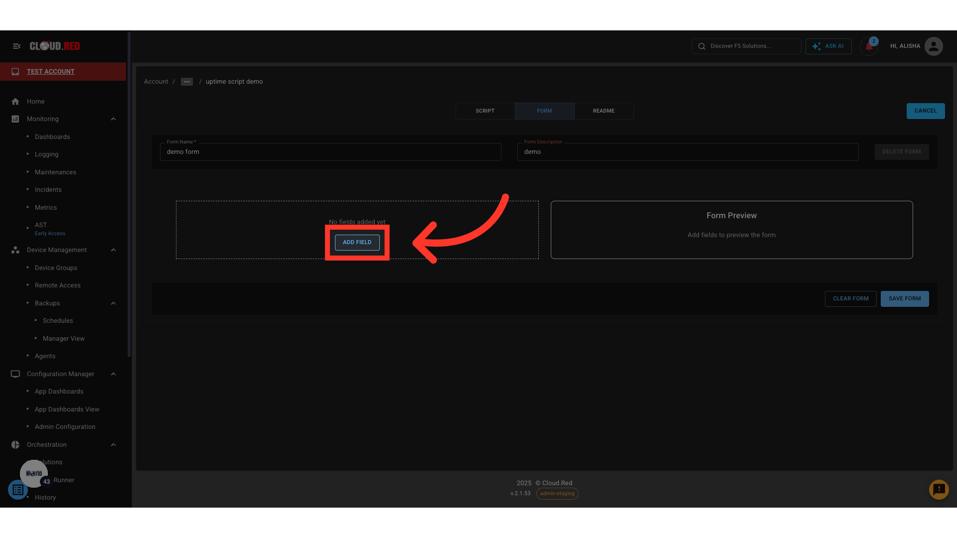
1. Click **Add Field**.
<img className="block h-96 dark:hidden" src="https://mintcdn.com/cloudred/AQSK3WOPlgyaBGvE/orchestration/orchestration-images/form-add-field-dark.png?fit=max&auto=format&n=AQSK3WOPlgyaBGvE&q=85&s=c3be0ad26238fc34ed27084555ae2d4f" width="1920" height="1080" data-path="orchestration/orchestration-images/form-add-field-dark.png" />

<img className="hidden h-96 dark:block" src="https://mintcdn.com/cloudred/AQSK3WOPlgyaBGvE/orchestration/orchestration-images/form-add-field-dark.png?fit=max&auto=format&n=AQSK3WOPlgyaBGvE&q=85&s=c3be0ad26238fc34ed27084555ae2d4f" width="1920" height="1080" data-path="orchestration/orchestration-images/form-add-field-dark.png" />

2. Select a **Field Type**.

<img className="block h-96 dark:hidden" src="https://mintcdn.com/cloudred/AQSK3WOPlgyaBGvE/orchestration/orchestration-images/choose-field-type-dark.png?fit=max&auto=format&n=AQSK3WOPlgyaBGvE&q=85&s=96863968738b0ef7b37eb37e023f68a1" width="1920" height="1080" data-path="orchestration/orchestration-images/choose-field-type-dark.png" />

<img className="hidden h-96 dark:block" src="https://mintcdn.com/cloudred/AQSK3WOPlgyaBGvE/orchestration/orchestration-images/choose-field-type-dark.png?fit=max&auto=format&n=AQSK3WOPlgyaBGvE&q=85&s=96863968738b0ef7b37eb37e023f68a1" width="1920" height="1080" data-path="orchestration/orchestration-images/choose-field-type-dark.png" />

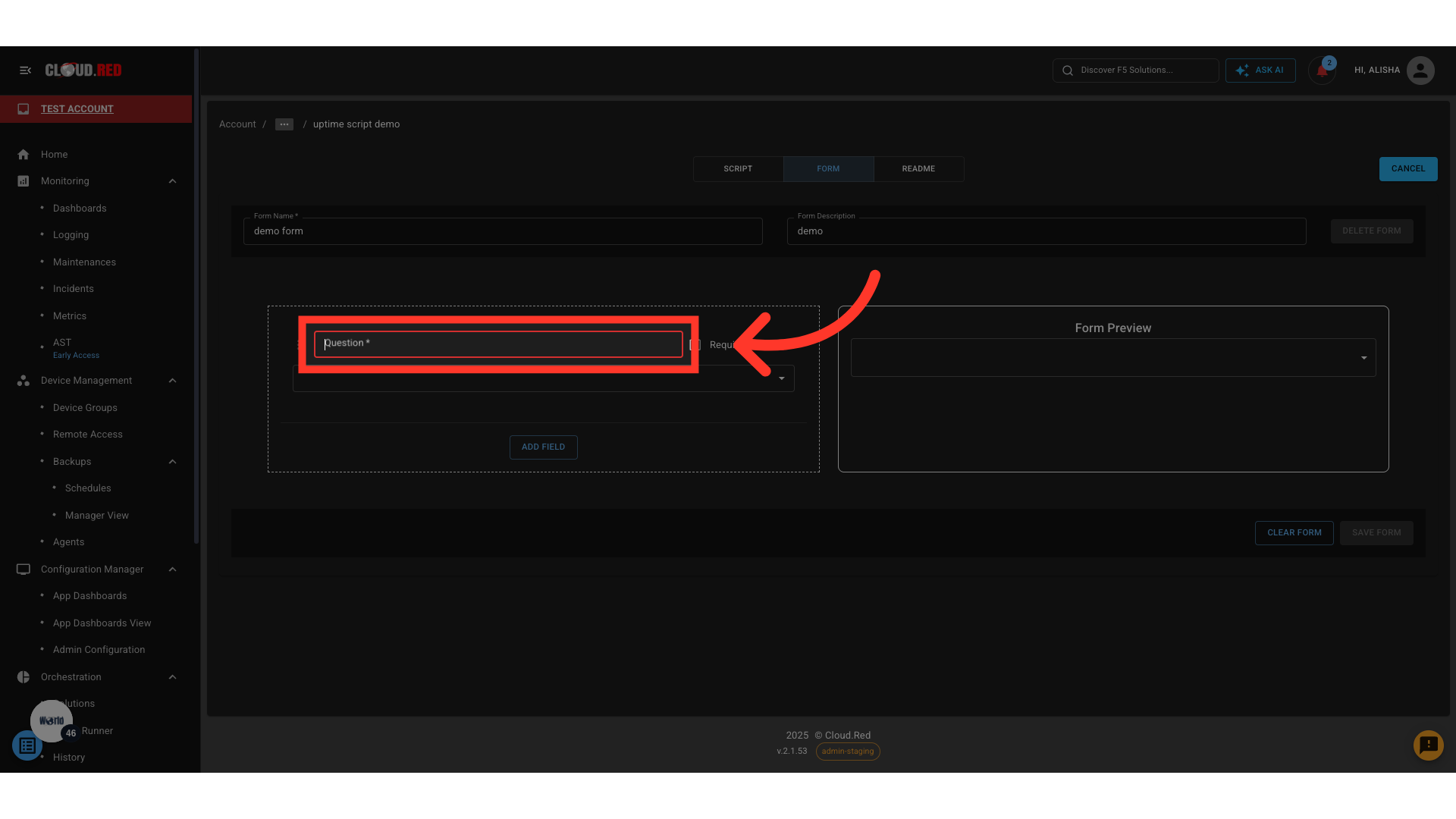
3. Configure:
   * **Question** – User-facing label of the field
   * **Variable name (`var`)** – Internal identifier
   * **Required** – Whether the field must be completed before submission
<img className="block h-96 dark:hidden" src="https://mintcdn.com/cloudred/AQSK3WOPlgyaBGvE/orchestration/orchestration-images/form-question-dark.png?fit=max&auto=format&n=AQSK3WOPlgyaBGvE&q=85&s=d2b22efed6923a3c7eb59e5d038162d4" width="1920" height="1080" data-path="orchestration/orchestration-images/form-question-dark.png" />

<img className="hidden h-96 dark:block" src="https://mintcdn.com/cloudred/AQSK3WOPlgyaBGvE/orchestration/orchestration-images/form-question-dark.png?fit=max&auto=format&n=AQSK3WOPlgyaBGvE&q=85&s=d2b22efed6923a3c7eb59e5d038162d4" width="1920" height="1080" data-path="orchestration/orchestration-images/form-question-dark.png" />

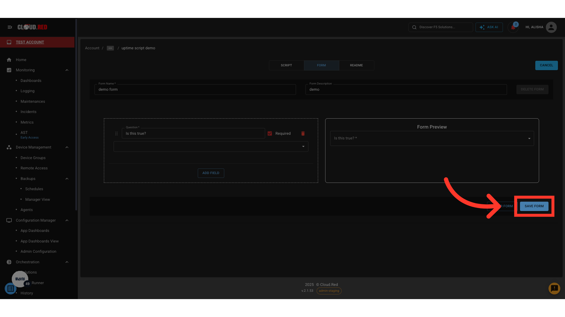
4. Click **Save Form**.

<img className="block h-96 dark:hidden" src="https://mintcdn.com/cloudred/AQSK3WOPlgyaBGvE/orchestration/orchestration-images/save-form-dark.png?fit=max&auto=format&n=AQSK3WOPlgyaBGvE&q=85&s=279751e8d159740738272ef23131fc42" width="1920" height="1080" data-path="orchestration/orchestration-images/save-form-dark.png" />

<img className="hidden h-96 dark:block" src="https://mintcdn.com/cloudred/AQSK3WOPlgyaBGvE/orchestration/orchestration-images/save-form-dark.png?fit=max&auto=format&n=AQSK3WOPlgyaBGvE&q=85&s=279751e8d159740738272ef23131fc42" width="1920" height="1080" data-path="orchestration/orchestration-images/save-form-dark.png" />

***

### Add Subfields (Conditional Logic)

Subfields appear when a **parent field's value matches a condition**.

<Tip> Subfields can be nested infinitely to build advanced logic flows </Tip>

**Example:**

* Boolean: *Do you have previous experience?*
  * **True** → Display Text: *Describe your experience*
  * **False** → Display Boolean: *Would you like training?*

**Steps:**

1. Select a field type that supports subfields (Boolean, Dropdown, Flag Dropdown).
2. Define the condition (e.g., **True**, **Option X**).
3. Use **Add Subfield** to create the subfield.
4. Configure the subfield parameters.
5. Repeat as required for deeper nesting.